


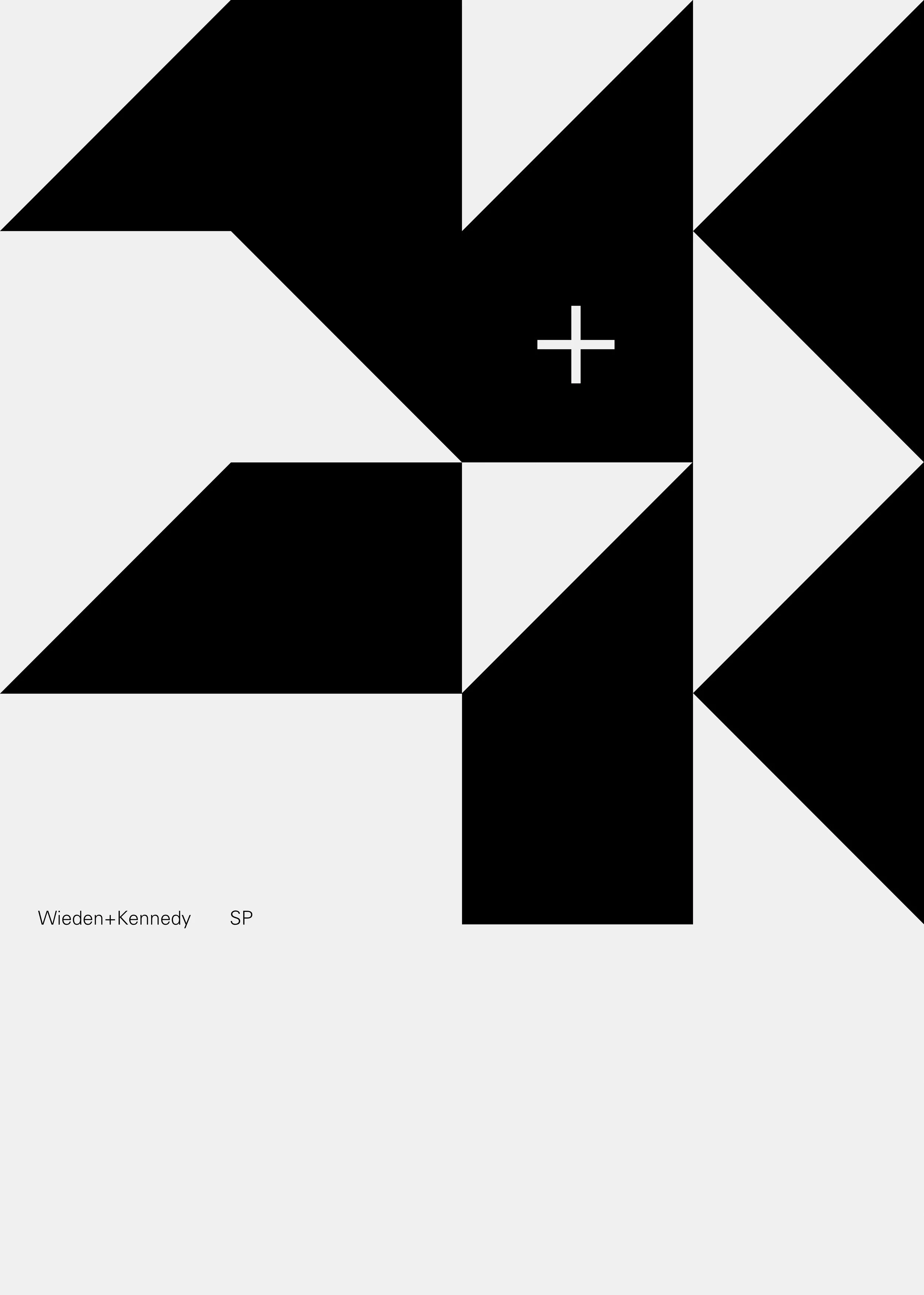


Rebranding Wieden+Kennedy São Paulo, we wanted to create a playful and versatile system. Looking into the city streets and visual language, we found inspiration in its most iconic and representative symbol: the sidewalks. Its pattern is an icon of the city and also represents the map of the state.
By breaking it in three elements, we were able to establish a system that allows the visual identity to assume different shapes, thus becoming a live element rather than a static one. Being alive, it is free to become a playful and versatile identity.
--
Role:
Head of Art / Creative Director
--
Designers:
Eduardo Tallia, Fabio Cristo
-
2017